NAC@50+ is a interactive storytelling experience, that will be available via an NAC@50+ website. Partnering with the National Arts Centre, my team was tasked with creating an engaging experience that would bring users into a 3D model of the building and educate on the history of the NAC, in a way that was unique from the standard panoramic virtual tour. This was a major project, spanning multiple years, with a fluctuating team size. Throughout that time, I was able to contribute to almost every aspect of the project.
My roles on this project included:
- Team Lead
- Product Design, UI / UX Design (Figma)
- Development and UI implementation in Unreal Engine (blueprints)
- Narrative Development
- Audio Editing
- Modeling and scene setup (Maya, 3DS Max, Unreal Engine)
Wireframes
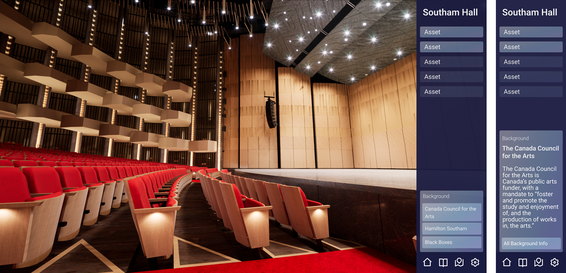
In the first iteration of wireframes, I was investigating how a menu that collapses in steps could function. This would allow a user to reveal information in varying degrees, and allow them to clear the screen almost completely, leaving more room for them to be fully immersed in the 3D spaces.
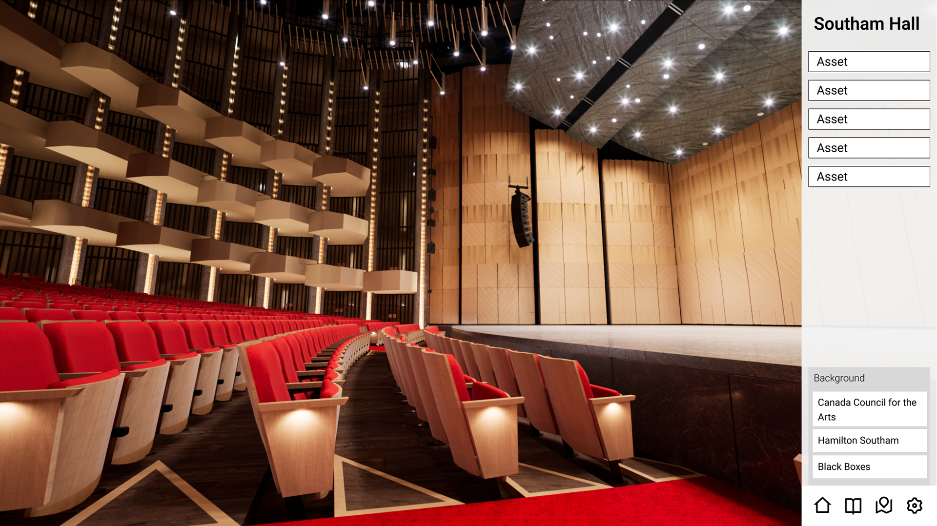
The fully open menu would have buttons along the top to open the main menu, settings, or return home to the story selection screen. Below, we would have the assets that the user is meant to find within the 3D scene. This section would show all of the room that the user will visit in the story, and open the current room to show the available assets. The bottom of the menu holds a map of the space, so the user can place themselves within the building.
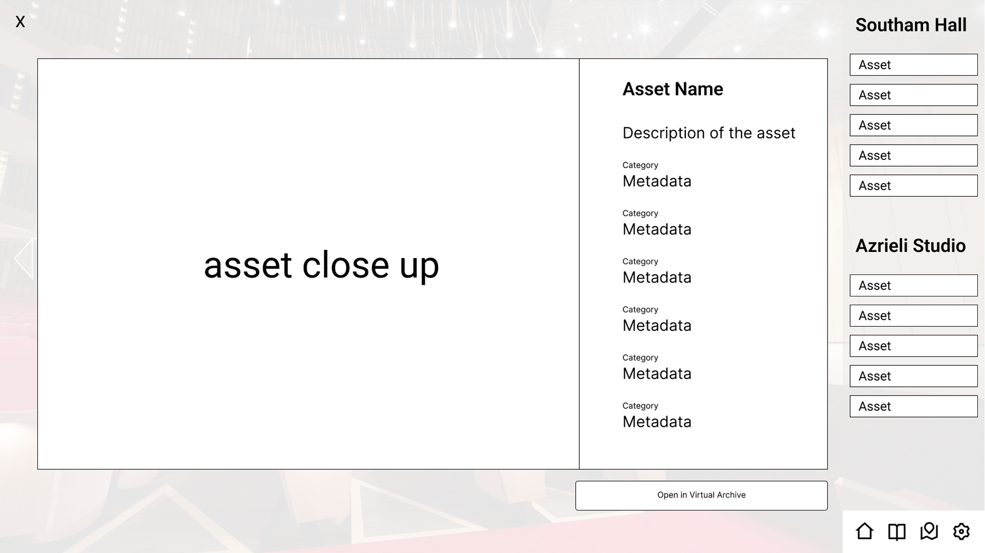
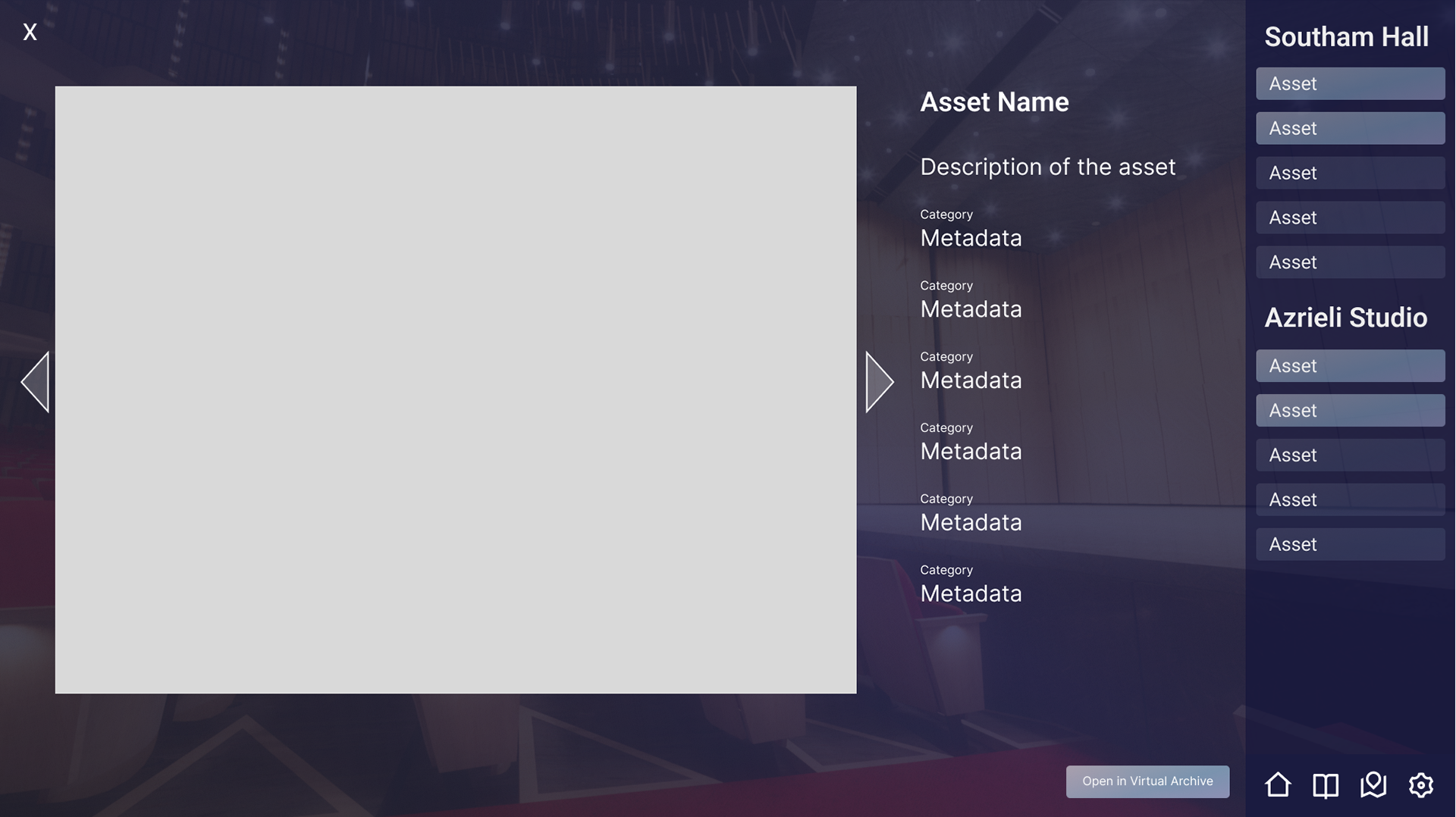
When an asset is selected from the menu, or discovered in the scene, the user would see the screen in the second wireframe, containing detailed information about the object and a closeup of the 3D model, image, or video.
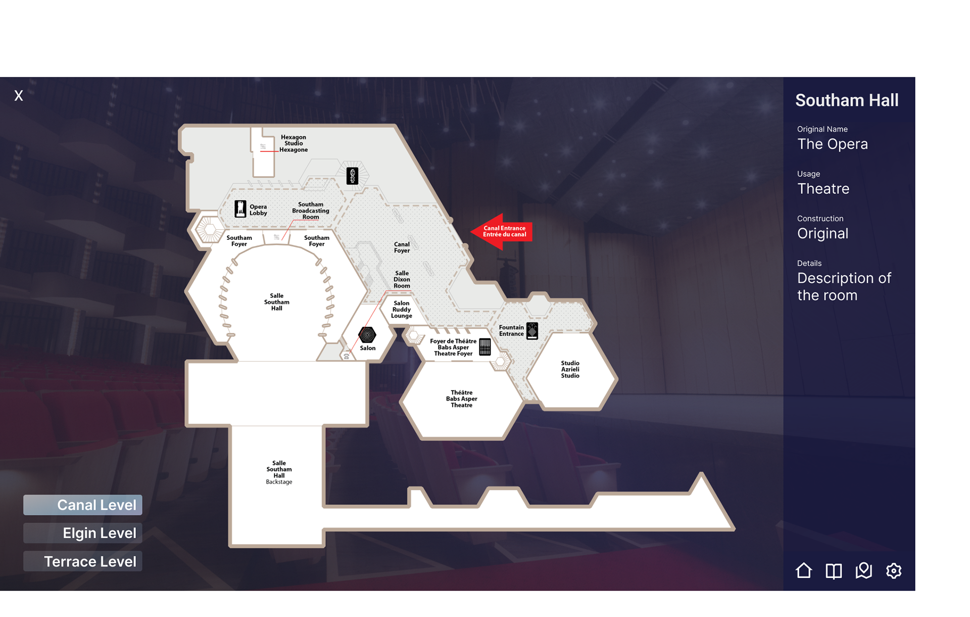
In the second iteration of the wireframes, I opted for a menu that was persistently on the side of the screen. This decision was made to keep the user more focused on the tasks that they're meant to be working towards in the game environment. The map is removed from the main section of the menu, and instead would be available to see by clicking the map button found in the bottom navigation bar of the menu. This design also puts more emphasis on naming the room that the user is currently in, for clarity.
An additional panel was added at the bottom of the menu, with keywords for users to click on to get a quick description or more information.
The asset details screen now changes the menu to a different state just for this screen, and can be accessed by discovering an asset, selecting an asset from the main menu, or clicking the journal button in the navigation bar. a transparent overly is added behind the details window, this is to help convey to the user that their game is paused while they are on this screen, and there is no action happening in the scene.
First Iteration Mockups
The second set of wireframes was then developed into a mockup, applying the NAC's brand colours, and investigating how we could indicate assets that have been found versus assets that the user should still be looking for. An asset would not be clickable in the menu until it's found, so I wanted the assets in the list to look and feel like buttons once they've been discovered.
Here, I was testing out a few different styling options for the asset details page.
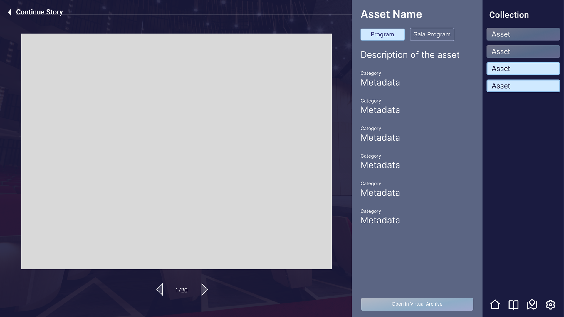
Final Mockups
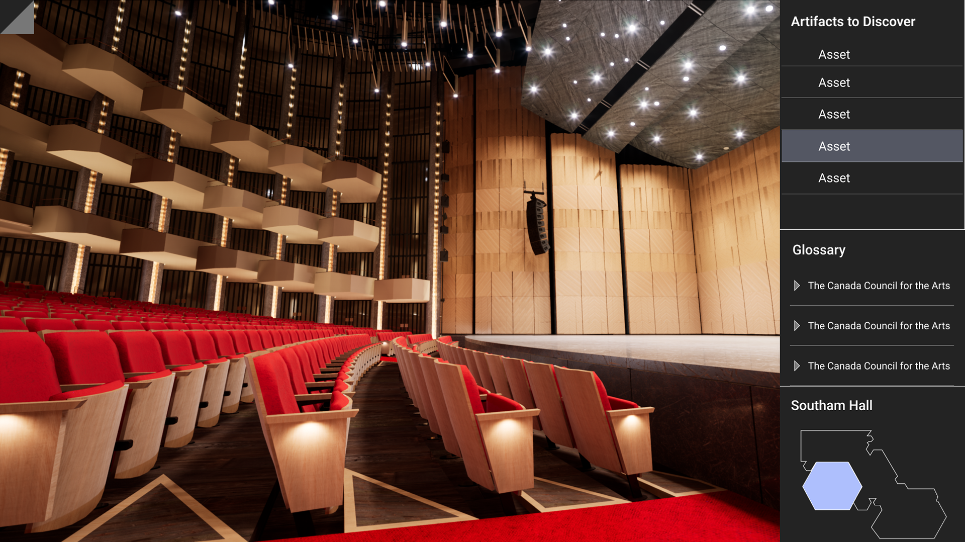
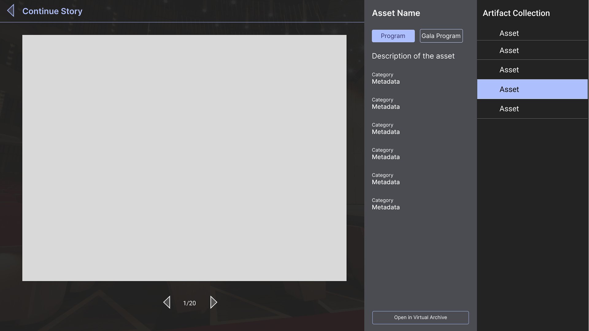
In the final version of the screen, we've widened the menu slightly to better accomodate the amount of text. The colour palette has kept the purples from the branding guide, but used it only as a more impactful accent against a neutral dark background. In discussions, it was decided that an interactive fullscreen map was not serving the narrative, as the user would not be able to select the room they move to, and for that reason the mini map was added back in as the sole map visual. The two icons that are not related to the storytelling, Home and Settings, have been moved out of our sidebar menu and into the top left corner to separate functionality relating to gameplay and utility functions. To preserve as much screen space as possible for the scene, they are by default hidden under a small page corner (as these are the functions that will take the user out of the story); clicking the page corner opens up a small menu to reveal the icons, and similarly will close the menu back up.
A 'Continue Story' prompt was added beside the button to close the asset details. This is to help communicate to the user the state of the game- paused when this screen is open- and what to expect when they close the menu- for the story to start back up.
